CARDS FOR PREGNANCY LOSS
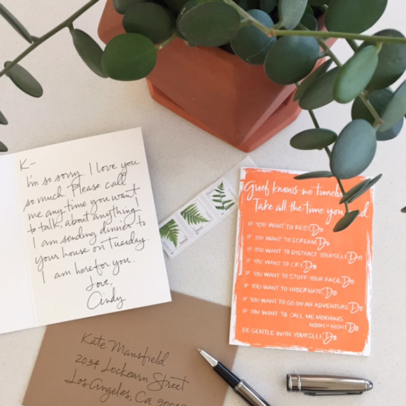
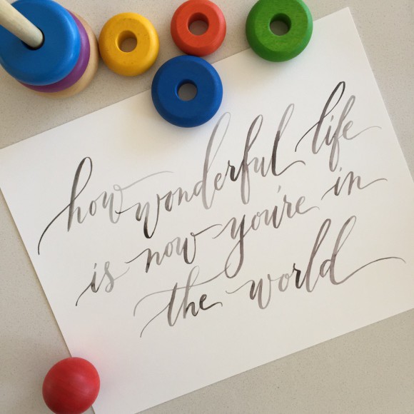
October is Pregnancy and Infant Loss Awareness Month. I blogged last year about my own losses – 5 in total, 2 of which were late in my second trimester – under the hashtag #letstalkaboutloss and offered some prints for sale as well as free wallpaper and tattoo downloads of the prints. At the time, I was seven weeks into another pregnancy, terrified of the outcome, and although I was very happy with the way the prints came out and overwhelmed by the response, I felt a little funny espousing being completely honest about pregnancies from minute one while feeling I couldn’t be completely honest because it was all just too much to handle.
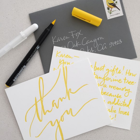
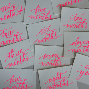
This year, after the birth of my “rainbow baby” in June, I was ready to commit my full heart to another project, and just as I was trying to decide what to do, Dr. Jessica Zucker, a writer and psychologist specializing in women’s reproductive and maternal mental health, who last year started the #IHadAMiscarriage campaign, commissioned me to create nine designs for her line of cards for pregnancy loss that is launching today. I saw it as a perfect project that touched me so deeply – I could help to create cards that are so lacking in the marketplace today.
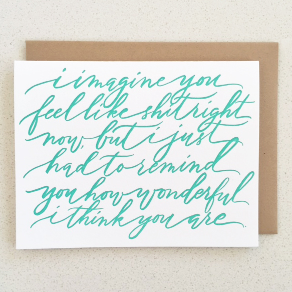
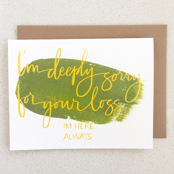
The hope is that these cards help normalize the grieving process and the conversation about pregnancy loss, and offer up an easy way for someone to reach out to a loved one. Dr. Zucker’s words ring so true to those that have experienced losses. They don’t beat around the bush. They are honest. They admit mistakes (that friends and family of people who have had losses so often make.) Sometimes they are even a little funny. These are the cards I wish I received.
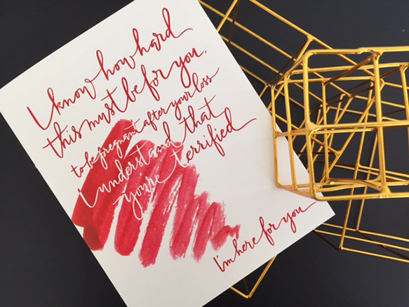
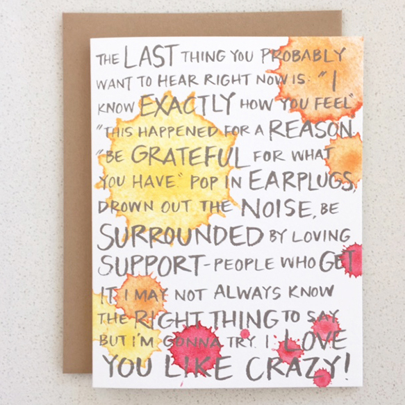
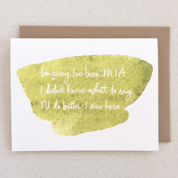
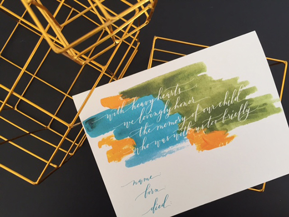
See all nine and purchase the cards here. (It’s never too late to send one, either.)

