CALLIGRAPHY WORKSHOP AT URBANIC!

I’m so excited to announce that I am teaching two workshops at Urbanic in Venice on November 3rd.

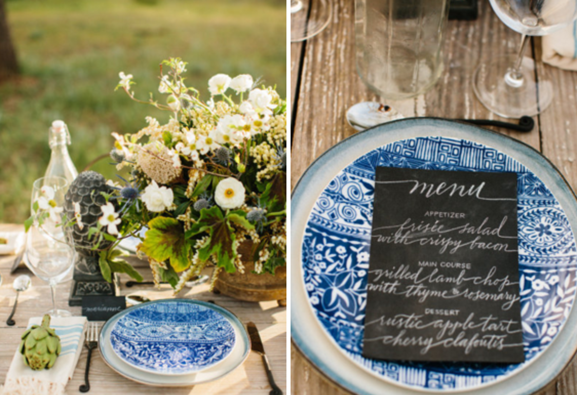
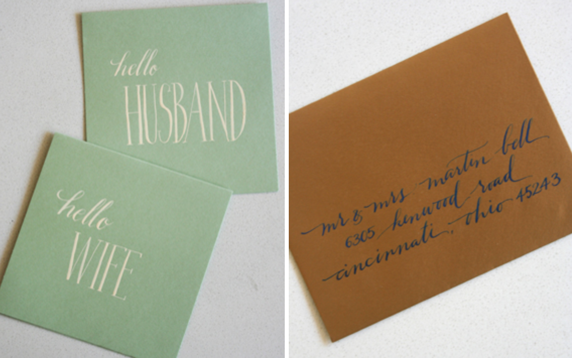
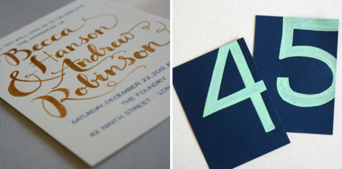
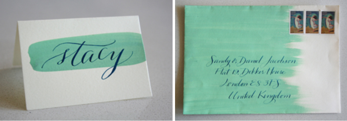
We’ll cover the basics of pointed pen calligraphy and learn how to use that to create your own signature style.  We will also spend some time playing with color – you’ll learn about mixing gouache and how to use bold colors to make a big impact.

There will be treats and take-home goodies and it should be a fun time.

Space is very limited so sign up quickly!

Hope to see you there!

CALLIGRAPHY WORKSHOP AT URBANIC!2018-05-22T13:32:53-07:00

LATELY ON INSTAGRAM…


1  A return address stamp

2  Some tattoo options

3  New neon edged, foil stamped business cards

4  White on kraft for a french wedding

5  Leaf escort cards

6  Packets of samples on their way out

7  Embossing my logo and return address on those packets

8  Shrinky dinks for Father’s Day

9  Luggage tag escorts

10  Emerald green and white on kraft

11  Pretty in pink

12  Delicate escort card tags

13  A new style – combo of Erin and Rina (more to come!)

14  Letterpressed invitation suite

15  Oliveta Design logo in the works

16  A German poem

17  Welcome to the world baby Milo!

18  Tattoo workings

19  Chalkboard escorts

20  A new diagonal format


Whew!  A lot to catch up on.  I like to put my Instagram hits here, too, for people who don’t see my feed but are looking for new ideas.  Instagram is such a quick way to show my work – unfortunately I can’t do blog posts about everything!  Again, you should follow me!


LATELY ON INSTAGRAM…2018-05-07T20:02:38-07:00

KALA + JARED – WEST HOLLYWOOD, CA

Kala and Jared got married on the roof of the London Hotel this July, overlooking all of Los Angeles, in an “English Garden” wedding planned by Sullivan Street Events.  I had a blast working with Kala and her planner, Alison from Sullivan Street.  They were so open to any ideas I had and wanted to incorporate calligraphy in every place they could.

I thought my leaf escort cards would be perfect for this setting and Kala loved the idea.  I also did programs, table numbers, and 4 versions of menus (one for each of the entree choices), and then personalized the menus for their 180 guests.  From the photos, it looked like such a beautiful night.


Congrats Kala and Jared!

All photos by Braedon Photography

KALA + JARED – WEST HOLLYWOOD, CA2018-05-22T13:33:18-07:00

A CHALKBOARD THANK YOU

When we went to NYC about a month ago our friends, (the unbelievably talented prop stylist Randi Brookman Harris and her husband Jacob Harris,) graciously offered us their apartment while they were out of town.

We walked in to find everything we could ever need labeled in Randi’s characteristic neon orange masking tape, Charlie’s name spelled out in bath toy letters, and this little note on the chalkboard wall in their kitchen:

(By the way, I NEED a chalkboard wall in my kitchen if and when we ever buy a house!)

Anyway, I couldn’t disappoint, and with the way the rest of the apartment was so fabulously decorated, it needed to be GOOD.  I mean check out this little slice of the apartment – I can’t even tell you how awesome the rest of it is!  (Oh, and check out the gratuitous photo of my super cute kid, of course.)

So I set out to letter the perfect thank you note.  I used a combo of block lettering and a swoopy script style, and considering I didn’t have any of my standard tools (ie. white charcoal pencils or a ruler) I think it came out pretty well.

Of course Charlie had to get in on the action, too:

We had a blast in our old stomping grounds, which, in large part, was due to our friends’ generosity and style.  Thanks again Randi, Jacob, Marlowe and (how did I forget?) Olive!

A CHALKBOARD THANK YOU2018-05-22T13:33:45-07:00

PHOTO SHOOT: MARIANNE WILSON & KNOT JUST FLOWERS

A few months ago, Sharon of Knot Just Flowers asked me to collaborate on a “European Boho” photo shoot she was doing with the fabulous Marianne Wilson.  She had seen the place cards I did for The Cream and wanted a similar chalkboard effect for menus and place cards.  Since she had a tight deadline, and since I didn’t have any black chalkboard paint on hand, I used some black linen paper, dirtied it up a bit with some chalk, and wrote on it with some white charcoal pencils.  They came out great and Marianne captured some pretty gorgeous photos.

Even better – the shoot was featured today on Style Me Pretty!  There’s some serious inspiration in these photos.  Maybe I’ll throw a European Boho dinner party one of these days…


PHOTO SHOOT: MARIANNE WILSON & KNOT JUST FLOWERS2018-05-23T10:23:40-07:00

HANDWRITTEN LOGO-MANIA

I have been asked to design A LOT of handwritten logos lately.  I really love this kind of creative work and it is such a nice break from working on envelopes and placecards. It is also so fun to see them up and running on my clients’ websites.

Here’s a little sampling….


I have also done a lot more recently that are not yet ready to go live, so stay tuned….

HANDWRITTEN LOGO-MANIA2018-05-04T16:17:10-07:00

WEBSITE WORK: LOKI LOKI

A few months ago, Cody McBurnett, the Brooklyn based owner of Loki Loki, a branding and visual identity firm, contacted me to do some work for her new website.  (A website, which, coincidentally, has a very similar visual concept to mine – I guess we have a similar aesthetic!)

She had some lovely testimonials from a bunch of her clients, and wanted them to look handwritten and original.  Not a problem!  She chose a number of styles from my style sheet and I went to work pairing styles with the appropriate testimonials.

(She did a blog post about the collaboration as well!)


I think her site looks awesome!  Don’t you?

WEBSITE WORK: LOKI LOKI2018-05-04T16:19:57-07:00

INSPIRED BY THE CREAM

Photo by Raya Carlisle

I’ve been waiting for what seems like forever to write this post.  The Cream Event took place on March 10 at Vibiana in downtown LA.  I have been working like a crazy person since the minute it was over (not to mention for weeks up until the second it started), so I just didn’t have the time to give the post the attention it deserves, and I also wanted to wait until the photos were released.  We got the photos a couple weeks ago.  Wow!  These photographers (Rad + In Love, Raya Carlisle, Mr. Haack, and Paige Lowe) are unbelievable – and also – wow! – this event was AMAZING.  Those Bash, Please girls really know how to throw a party and the sheer talent that was in that space was staggering.  Unfortunately, I mostly saw everything through the photos, because I pretty much didn’t leave my table all night.  I was writing names on bracelets to give away and at any given time had a line of at least 25 people waiting.  But that was awesome – don’t get me wrong – I met so many great people and somewhere around 800 people were introduced to my work.  What could be better?

Photo by Rad + In Love

Photo by Rad + In Love

Photo by Rad + In Love

Photo by Rad + In Love

Photo by Raya Carlisle

Photo by Rad + In Love

Photo by Raya Carlisle

If you can’t tell from the photos above, the color inspiration for the event included mint, emerald, gold, and navy, with a little bit of wood and ivory.  Since I didn’t exactly have samples lying around that fit into this color scheme exactly, I made all new samples exclusively to show here.  And I had A LOT of fun with it.  I was very inspired to think of new and different uses of calligraphy.  New formats for envelopes.  Escort cards on leaves and rocks and jars with flowers in them.  Painted placecards and envelopes.  Below are a few shots that I took of the standouts.  I would love to use any or all of these ideas for a real wedding.  Just ask.  Please!

Real chalkboard escort cards (More on this to come!)


Also, check out the coverage on 100 Layer Cake – Part 1, Part 2, Part 3 and Part 4!

INSPIRED BY THE CREAM2018-05-23T10:22:04-07:00

LATELY ON INSTAGRAM…

1  A wedding job on printed “watercolor” envelopes

2  Rina in white on black envelopes and belly bands

3  Chalkboard menus and place cards for a photo shoot

4  Neon escorts!

5  Simple, modern wedding envelopes

6  Finally able to put this kid to work!  (On an awesome splatter-paint job – more to come.)

7  My make-shift desk when I was on-site at Barneys in Beverly Hills

8  Tattoo designing

9  More neon!

10  Wedding envelopes in navy on gold


When I started this whole blogging/tweeting/social networking thing, I didn’t include my Instagram because it was mostly filled with photos of my kid.  But I have found it to be such an easy way to show off projects as I’m doing them, and so now my feed has a lot of pictures of my work (along with pictures of my kid – but it’s kind of nice to see all aspects of my life so you can really get to know me, right?)  Anyway, you should totally follow me.  It’s also a good way (along with Twitter) to know when I put up a new blog post (which has been super hard to do lately – hello wedding season!)

LATELY ON INSTAGRAM…2018-05-22T13:35:19-07:00

Go to Top